Pomegranate
Travel


What we did
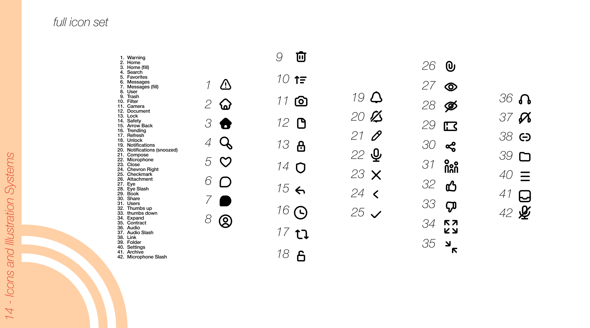
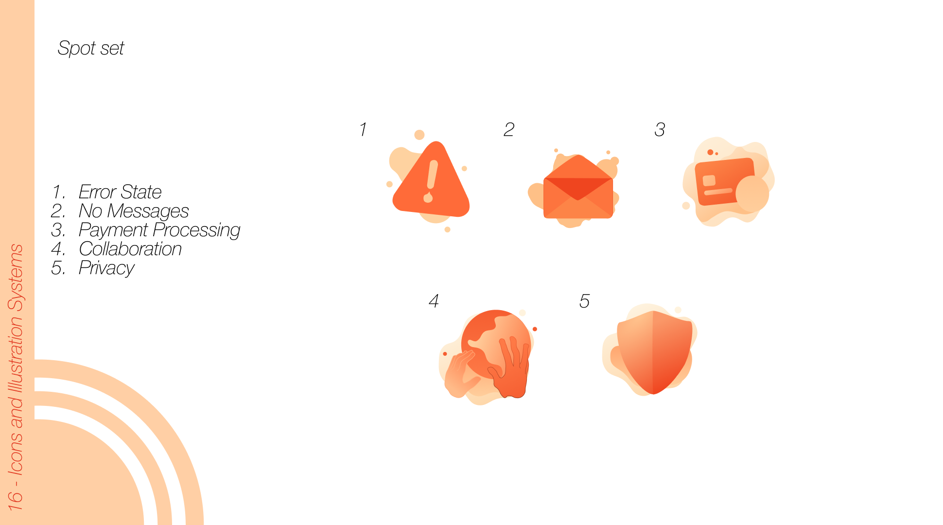
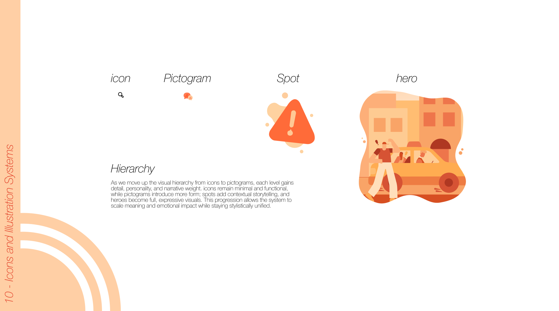
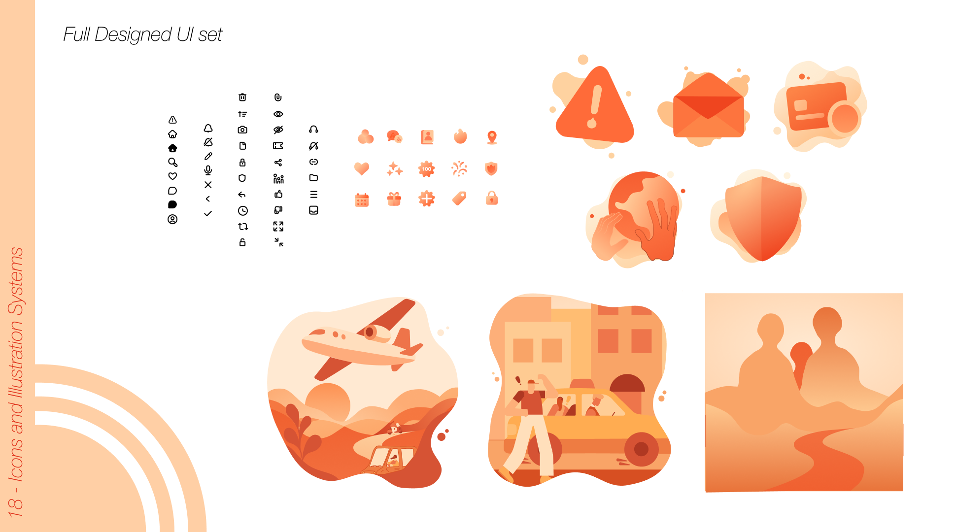
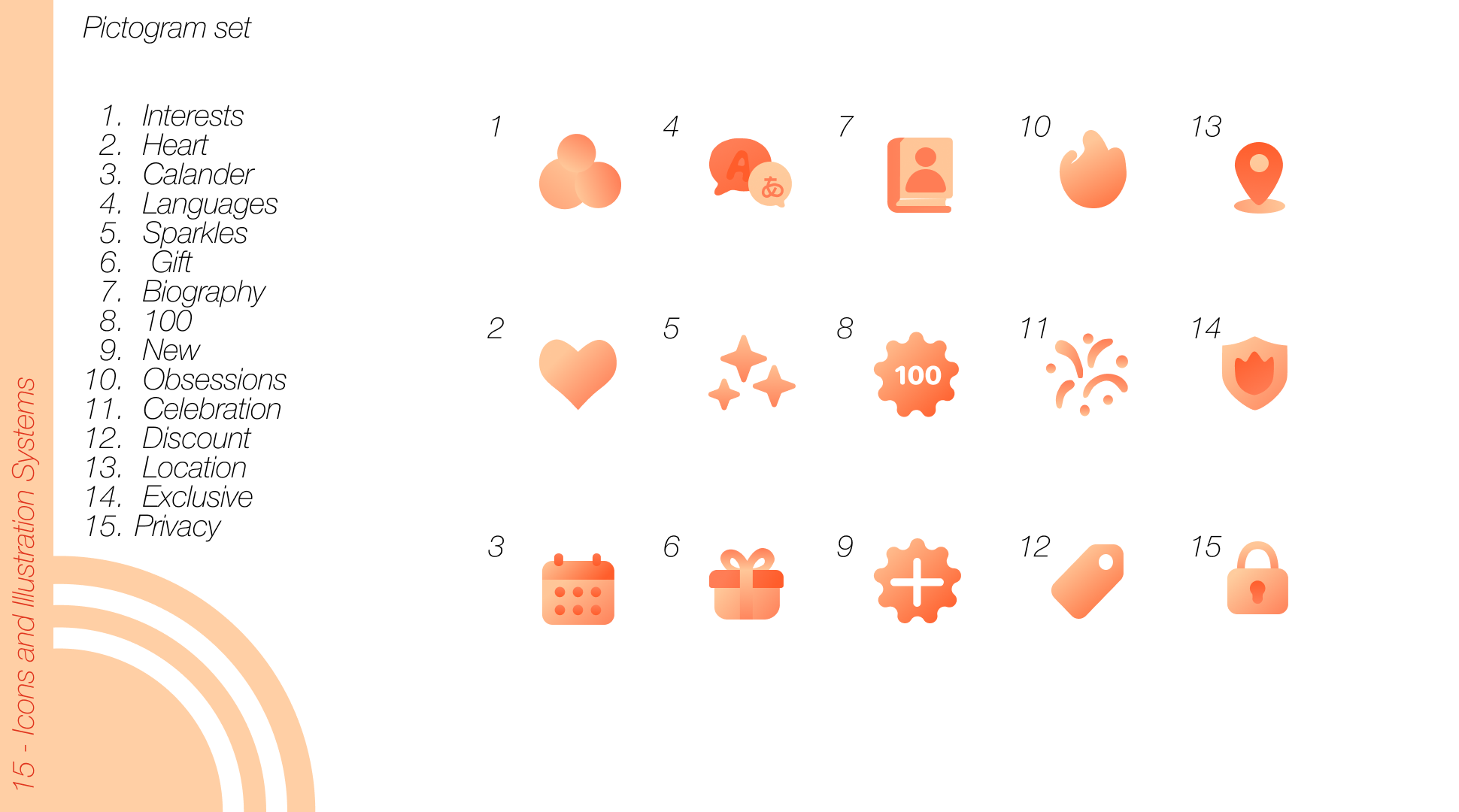
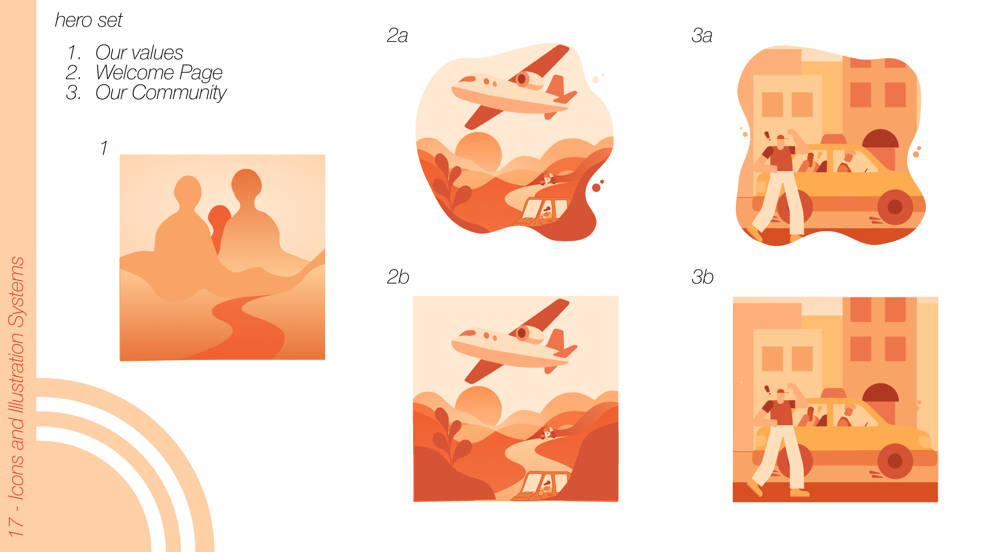
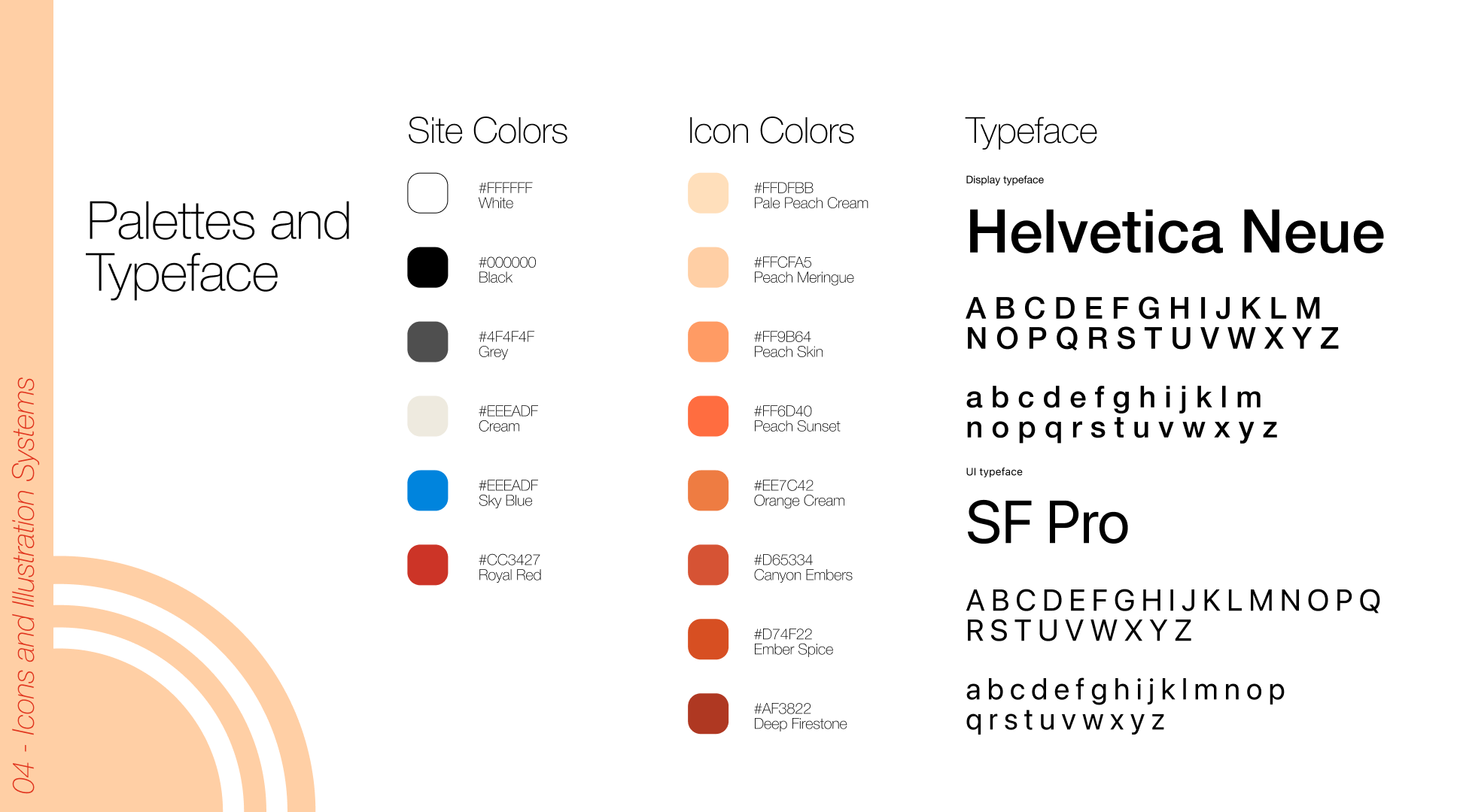
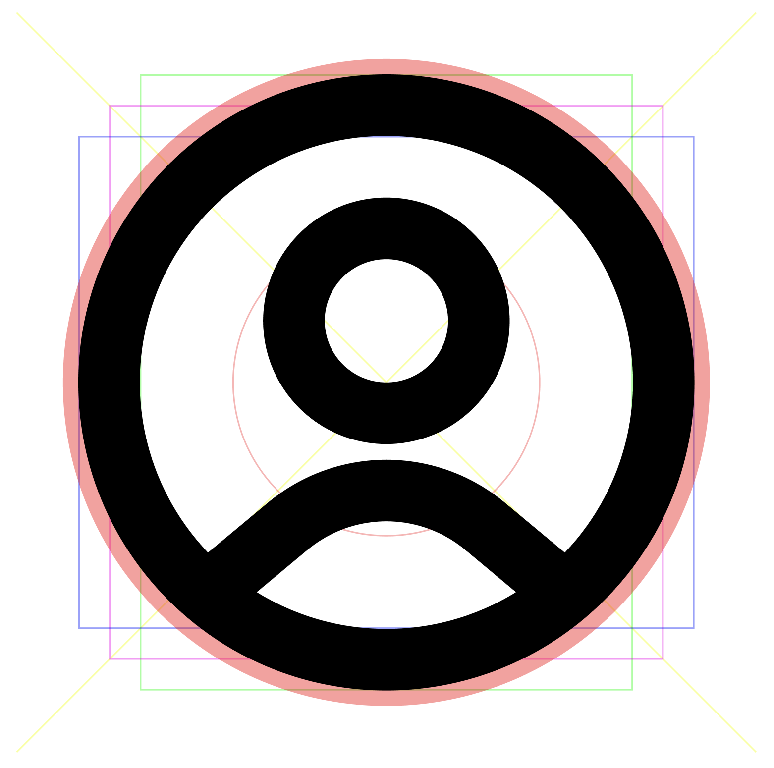
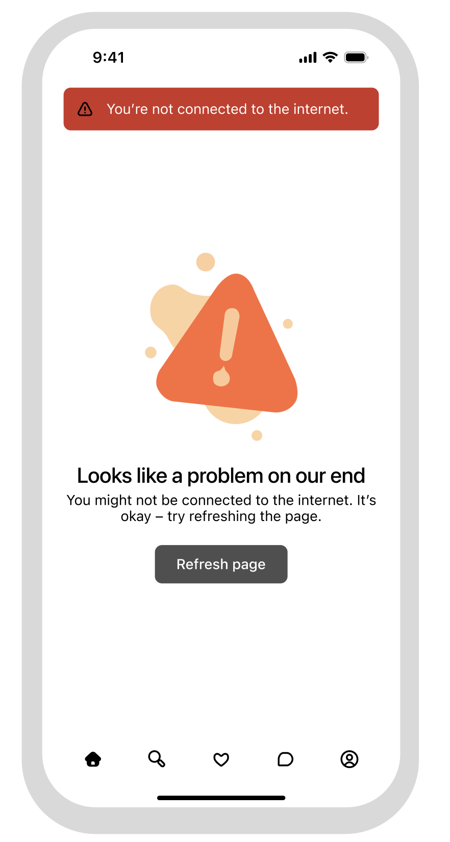
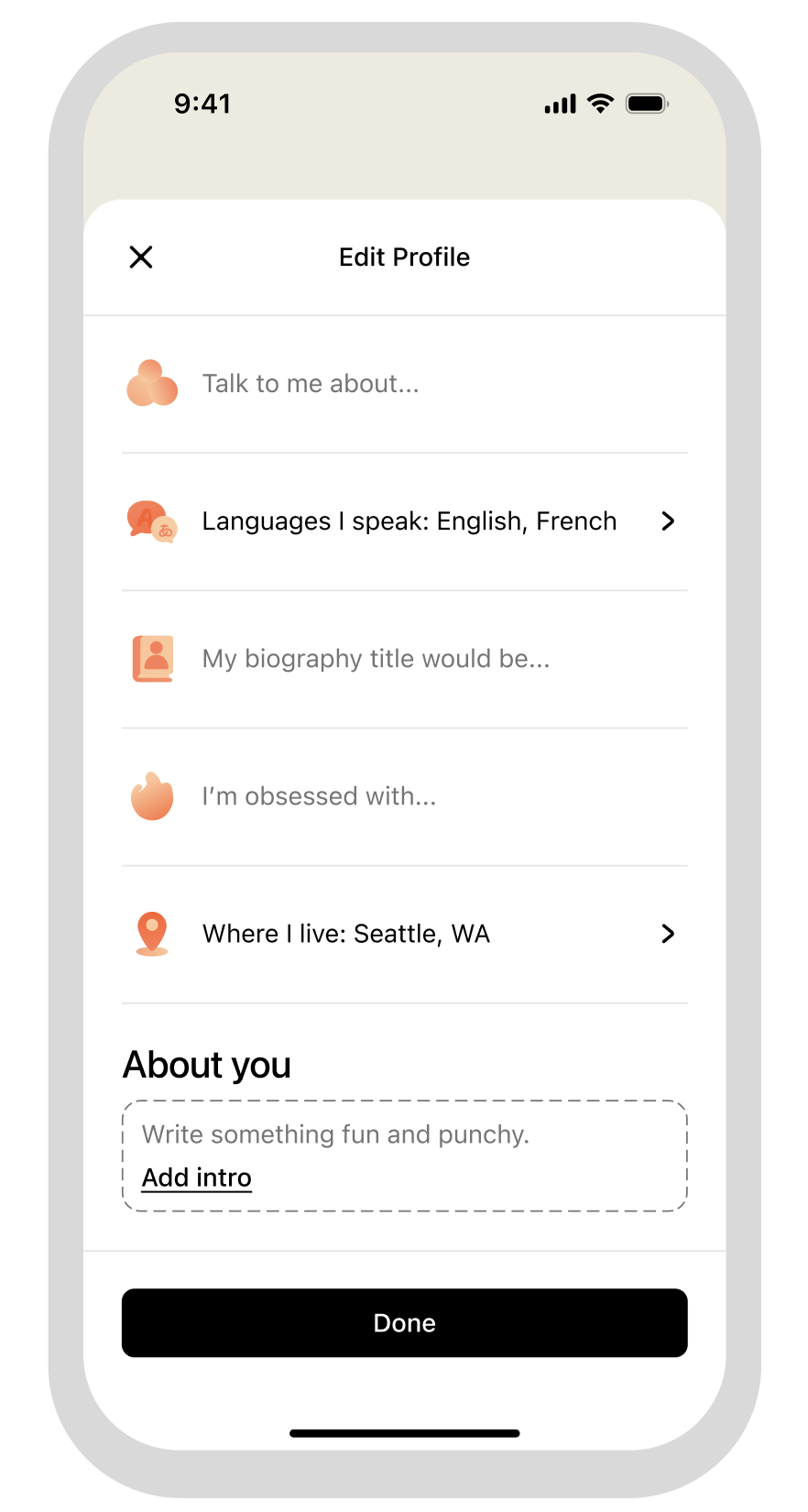
Starting with a general brand identity through typefaces and representational imagery, our goal was to create a strong icon set, pictogram set, some spot illustrations, and a hero illustration. Drawing from Helvetica Neue and SF Pro, we took inspiration from Alegria styles and created a set focused on creating a clean, distinctive, and readable icon identity. With the focus being on readability and creating a calm traveling experience, we built off the icon set to create a warm and inviting brand identity.
Connecting high level illustrations with icons is no simple task, but by minimizing harsh lines along with a general focus on roundedness, we allow users to feel comfortable when experiencing any part of our mobile app.